Citizen Pie
Simplifying the mark of a quirky local pizza shop located in Cleveland, Ohio.
Background
A revolutionary food concept needing a revolution of its own
•••
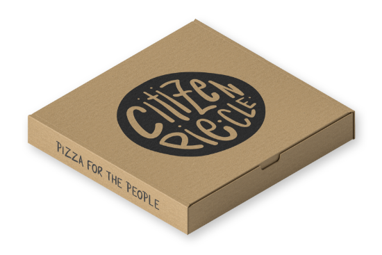
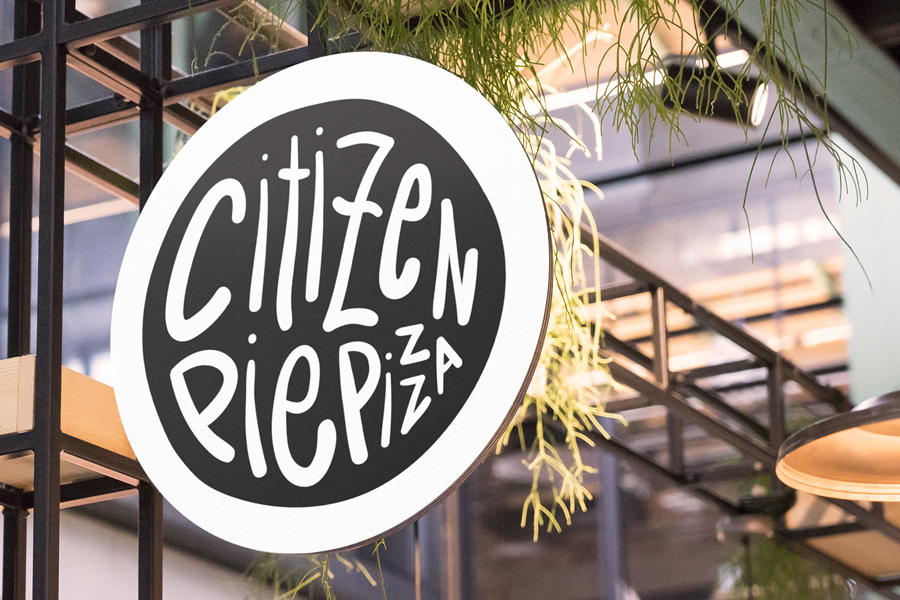
This build-your-own-pizza style pizzeria is the product of many years of dreaming for Lithuanian owner Vytauras Sasnaukas. Citizen Pie allows him and his customers to create quirky creations that cook in 90 seconds. The slogan for their pizzeria who claim themselves as the Pizza Revolution is “Pizza for the People.” Their previous logo needed a revolution of its own to keep up with the competitive quick-service food scene in Cleveland.
Solution
Eccentric hand lettering for a one-of-a-kind brand
•••
The new marks for Citizen Pie needed to emphasize the quirkiness of the restaurant and give it a more contemporary feel. To do this, I used a brush tool to create hand lettering that was imperfect in order to represent that it was all about the people. The two new mark options for Citizen Pie both breathe new life into the small business without taking away from the qualities that make it one of the most unique places to visit in Cleveland.


Details
•••
Nam si propter voluptatem, quae est ista laus. Quis est tam dissimile homini. Itaque rursus eadem ratione, qua sum paulo ante usus, haerebitis. Quantum Aristoxeni ingenium consumptum videmus in musicis? Nondum autem explanatum satis, erat, quid maxime natura vellet. Duo Reges: constructio interrete.
Ergo in utroque exercebantur, eaque disciplina effecit tantam illorum utroque in genere dicendi copiam. Nam si propter voluptatem, quae est ista laus, quae possit e macello peti? Quis est tam dissimile homini.
Type
Colors
Graphics
Feeling inspired?
•••
So am I... Let's get started on a project that will transform your brand.