Dynacom
Background
It was time for a change
•••
Dynacom is a generational business that has offered industrial clean air solutions since 1978. In the past 40 years, Dynacom has grown from a one-man operation serving the Cleveland area to having over 700 recurring customers across the midwest.
While their services may have changed over the years, the Dynacom name and the quality it promises have never wavered. In all of their impressive years of service, the Dynacom identity stayed the same. In 2021, Dynacom realized that the logo that carried them through the previous years no longer reflected their true focus on quality clean air solutions.
Solution
A modern spin for the next 40+ years
•••
The first step in revitalizing this brand was crafting a new logo that would become the baseline for Dynacom’s new identity. This came with new color choices that better reflected the company’s mission and positioned them as an innovative solution provider within their industry. Additionally, I established a new brand font that struck a balance between the technicality of their solutions and the modern space the company hoped to move into.
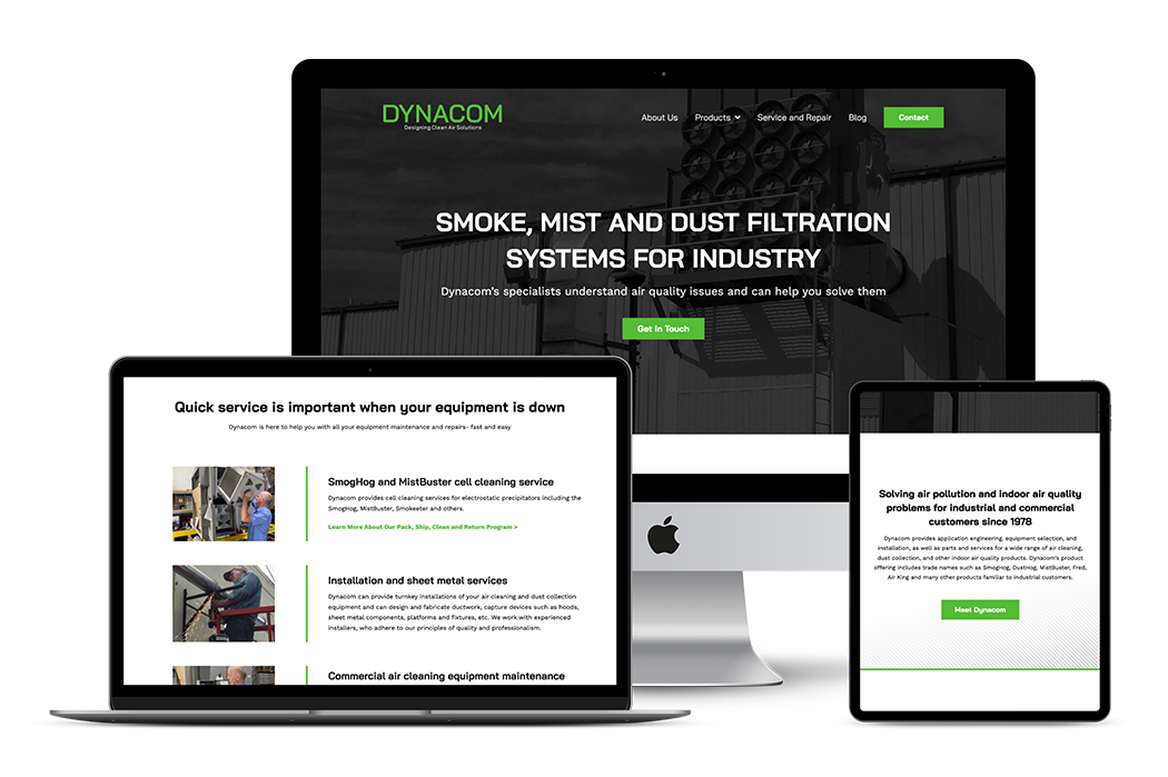
Once the new identity was finalized, I translated the updated identity to web pages. The website was a vital next step as it was a critical touchpoint for clients. The final design balanced a modern “dark mode” approach with brighter elements and white space for an approachable and innovative look.
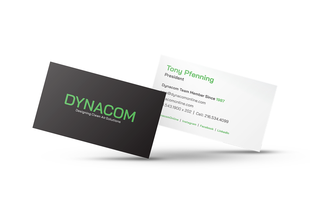
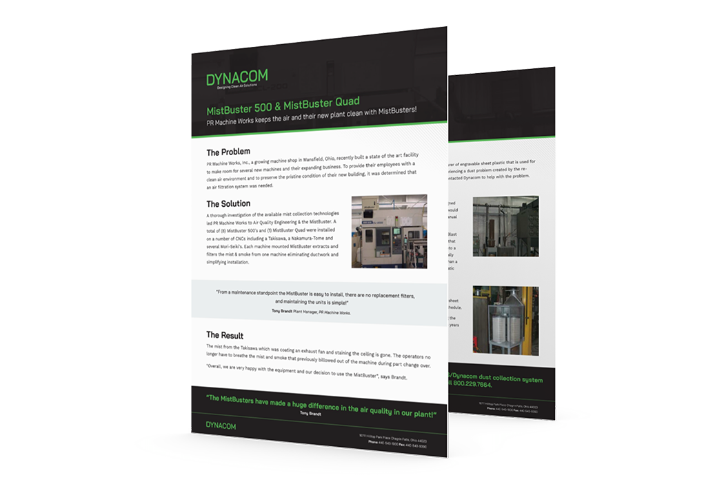
After completing the website design, I continued to update visuals across the Dynacom brand with the new identity to create a consistent brand experience. These updates included business cards, case studies, email designs, and more.
After a successful website and identity launch, company leadership expressed their renewed confidence in and passion for their brand.


Details
•••
Type
Colors
Graphics
Feeling inspired?
•••
So am I... Let's get started on a project that will transform your brand.