Ginger Digital Marketing
Ginger Digital Marketing is owned and operated by digital marketing powerhouse Lynne Wilson. Lynne came to me with a bold logo and a desire to translate that same look and feel across a website that clearly explained her services and established her expertise.
Background
Crafting a memorable experience
•••
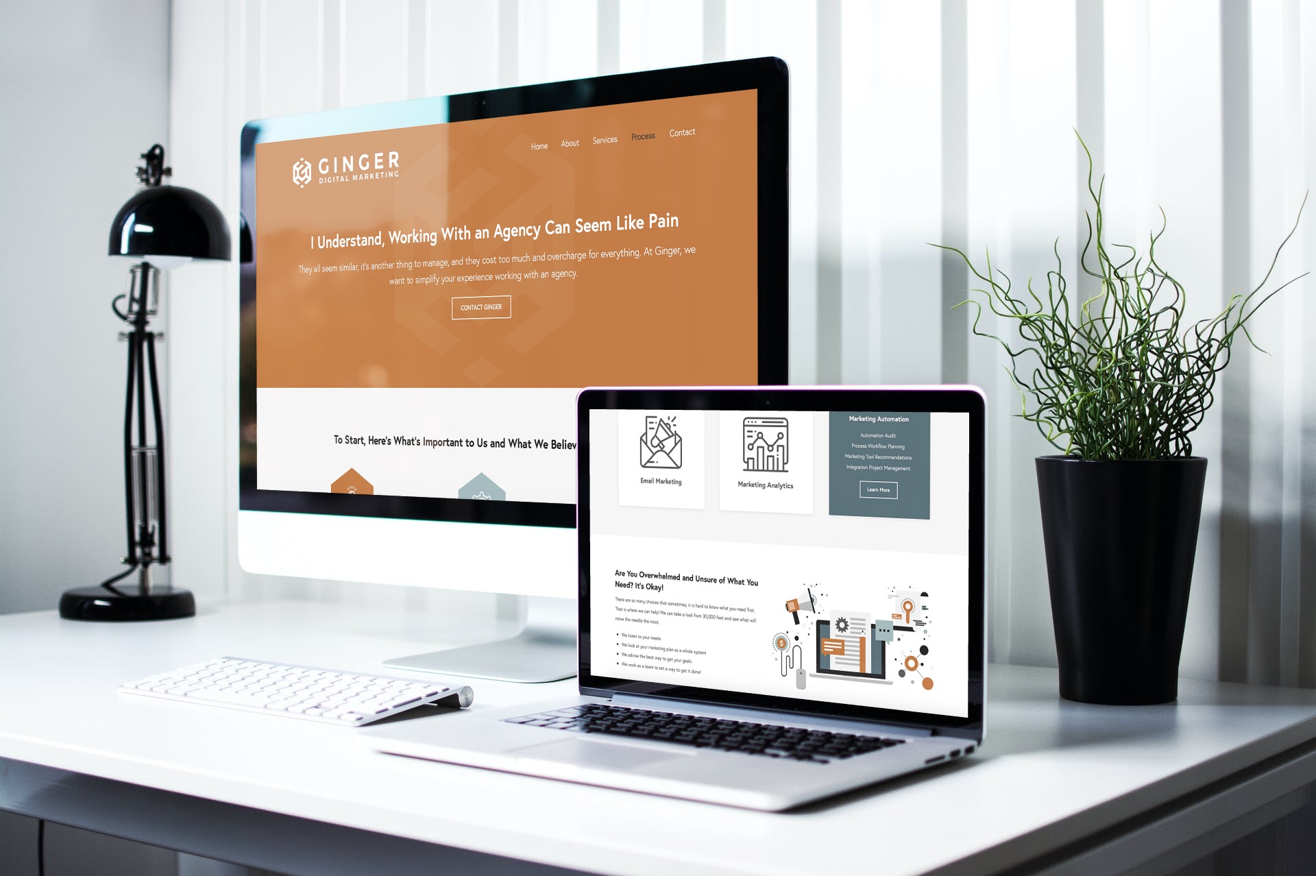
For the website, I worked with Lynne to think through the journey of Ginger website visitors. We wanted to ensure that there were plenty of points for interested prospects to contact Lynne, and that they felt comfortable reaching out even if they weren’t sure about what kind of marketing help they needed.
Solution
Bold and tailored
•••
As any brand in this day and age should, Lynne recognized that the Ginger website was going to be the hub for her business. To ensure that this website worked as hard as she was hoping, we sort of developed her brand while creating the website. Luckily the Ginger logo was a great starting point to develop the rest of her brand from. I started out by choosing a color palette to support the signature orange of the Ginger logo and then found some graphics that were cohesive with the feeling of Ginger’s logo, colors, and typography.
Even though the colors and visuals used for the website are very bold, they are also friendly and approachable. All of these brand elements combined resulted in a beautiful, clean website that will serve Ginger Digital Marketing for years to come.

Details
•••
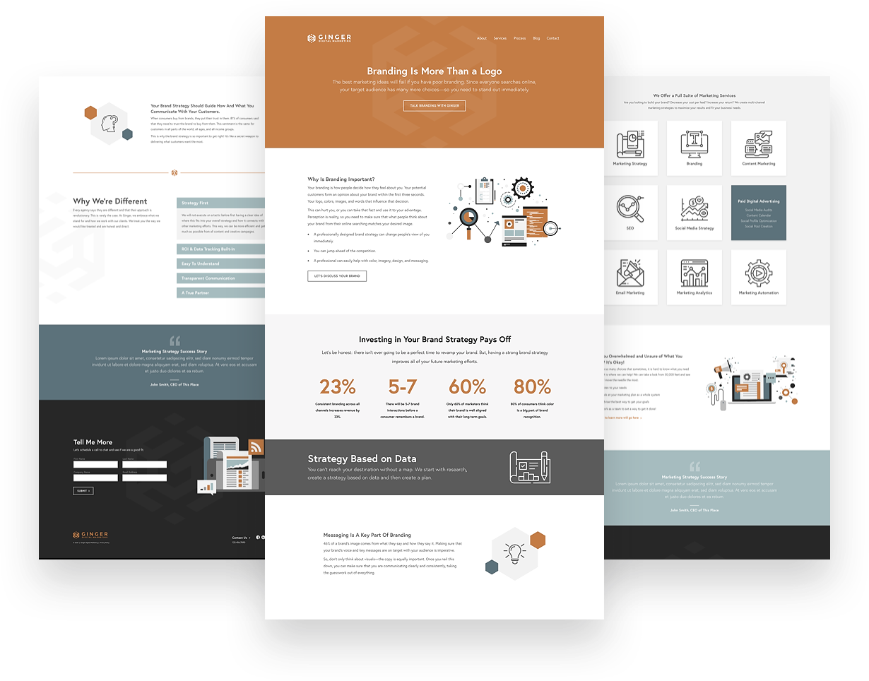
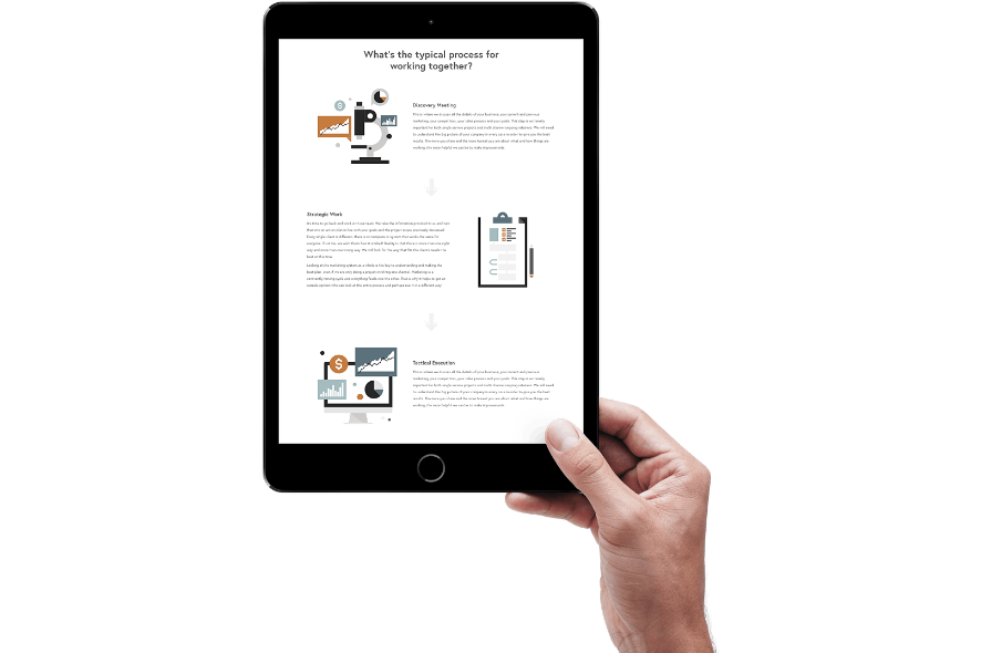
The Ginger Digital Marketing color palette turned out to be a really unique mix of cool and warm tones that combined to create an approachable but distinctive look. I chose the Europa typeface as something simple and clean that would be easy to read on the page. After all, Ginger is all about making things simple! The icons and illustrations chosen to represent the various services and brand values of Ginger offer a lot of visual interest and add to the hard-working copy on the website.
Type
Colors
Graphics
Feeling inspired?
•••
So am I... Let's get started on a project that will transform your brand.