Mortal Ink
Mortal Ink is a semi-permanent tattoo company striving to eliminate tattoo regret and help people express their personal style. I had the pleasure of designing this brand from the ground up and loved the challenge to work outside of my usual style.
Background
Crafting a brand that caters to the bold
•••
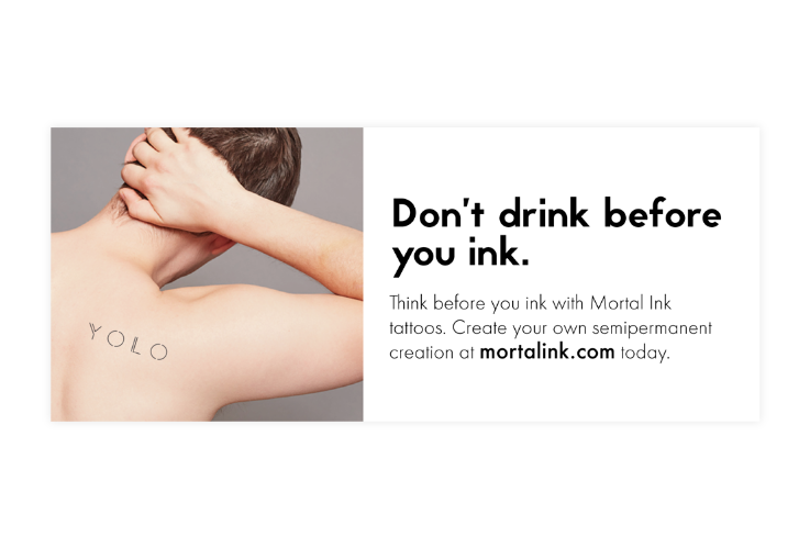
If you know someone with a lot of tattoos, then you might know someone who has some ink that they aren’t as in love with as when they got it. To combat this, Mortal Ink aims to give people the chance to test drive tattoos before committing to them for life. Mortal Ink achieves this through semi-permanent tattoos, or tattoos that only last for about 10-20 days instead of them lasting forever, hence ‘mortal’ from the name.
This brand required a bold look to match the unique audience that they cater to. They needed a logo, packaging, and inspiration for social media to deliver their messaging with.
Solution
Bold design for a game-changing tattoo brand
•••
There is a lot of imagery that is immediately associated with tattoos and tattoo shops. While I wanted to pay homage to those concepts, I also wanted to place Mortal Ink in a position to easily transcend tradition and move into the future. You’ll note that there really is a balance between traditional tattoo iconography and new design elements.
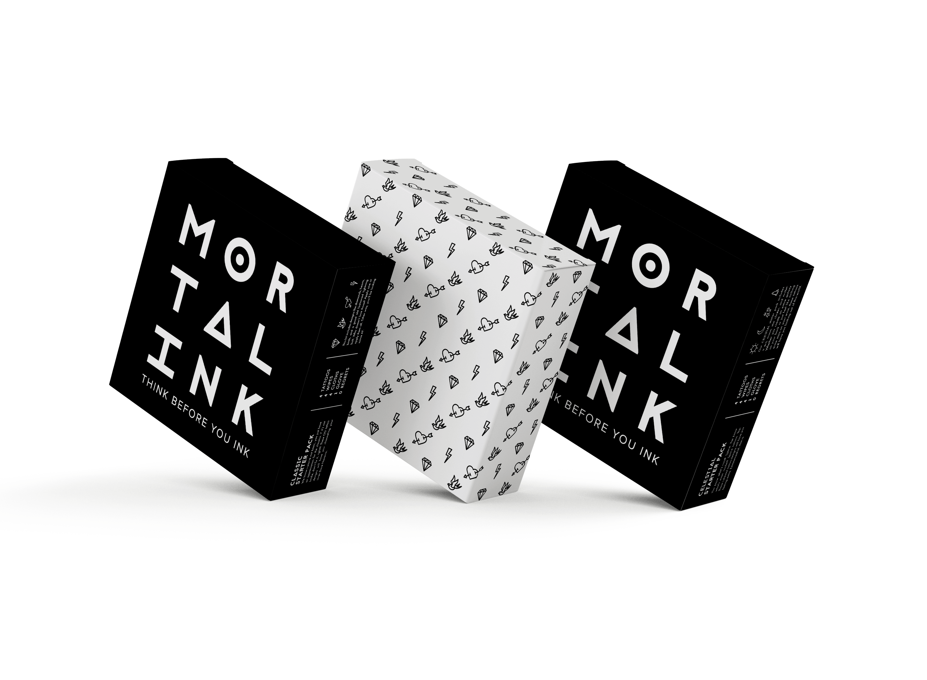
I used black and white to keep a sharp and edgy look, while adding pops of lime green to add to the tattoo shop feel. Additionally, I used a really unique typeface that features unique glyphs to reinforce the bold look. I was so excited to implement this look across deliverables. Mortal Ink offers starter kits consisting of curated tattoo collections and the tools customers would need to apply them. The packages have unique, Instagram-worthy packaging showcasing the bold brand.
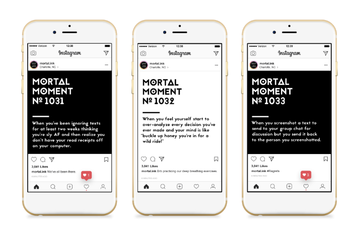
The mortal concept of this brand inspired a comical campaign of user generated content called the Mortal Moments campaign. The campaign encouraged consumers to share the moments that made realize they were merely mortals.
Details
•••
As mentioned, I stuck with high-contrast simple colors to allow the unique illustrated icons and bold typography to be the focus of this brand. The icons really pay respect to some very traditional tattoo ideas. All of these elements paired together create a bold and game-changing brand as unapologetically itself as those who try out their products.
Type
Colors
Graphics


Feeling inspired?
•••
So am I... Let's get started on a project that will transform your brand.