Ocean Aire
Ocean Aire is a full service FBO and flight instruction center located in Toms River, New Jersey. The owners of this business spent years passionately perfecting their services, but their brand fell through the cracks
Background
Re-establishing a dated brand as leaders in their field
•••
The main wish the client had for this project was to create a cohesive identity for the brand since that was something their existing brand lacked severely. They realized the brand needed to be brought into the 21st century and set out to show people that Ocean Aire is the best option for their aviation needs.
Solution
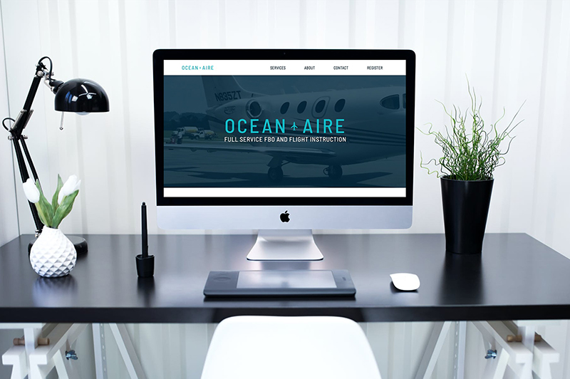
Clean lines and calming colors
•••
A defined color palette, clean type treatments and modern icons helped to make the client’s wish come true. The new look created for Ocean Aire established the company as technical experts in their field and made visitors feel more welcome to the Ocean Aire facilities. The brand update exceeded the requests of the client and prolonged the longevity of the brand.
Details
•••
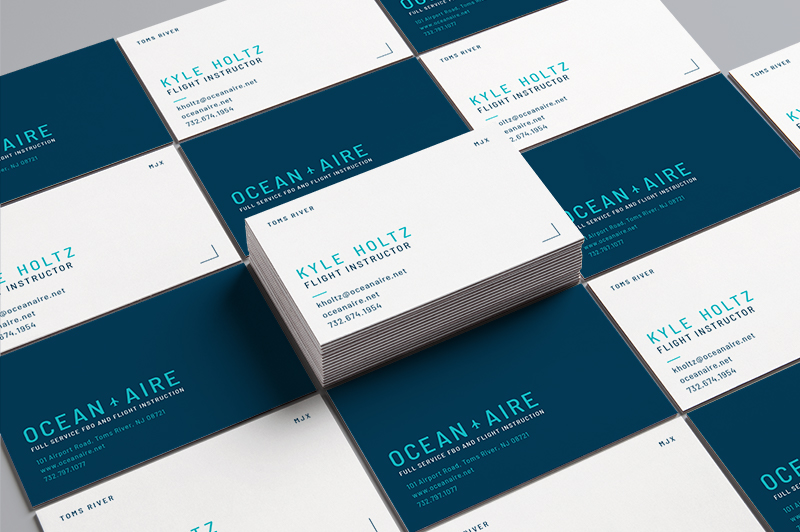
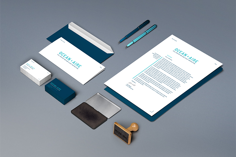
Starting from scratch with a client in an industry that is new to you can sometimes be tough, but the name and line of work of this client luckily heavily informed the brand elements. Knowing that the client wanted to position themselves as professionals and technical experts, we went with a blue color palette to exude a sense of knowledge and trustworthiness, while the line icons alluded to their technical abilities.
Type

Colors
Graphics


Feeling inspired?
•••
So am I... Let's get started on a project that will transform your brand.