Shawn Petite
Shawn Petite is a renowned mixed media artist and painter. She needed a website that reflected her free spirit and showcased her beautiful works and informative courses. I created a design that embraced her love of color and texture and allowed easy access to all of her unique resources for her users.
Background
So much content, so little space
•••
Shawn’s previous site was inundated with information and photographs that were not organized in a way that was helpful for visitors. The site served up all of the information that she was hoping for, but were users really sifting through what was there to find what they needed?
Since a large portion of the content on Shawn’s website was beautifully busy mixed media art, there were plenty of places for user’s eyes to get lost or for them to become overwhelmed. Shawn offers so many great resources, workshops, and templates that I didn’t want visitors to miss out on because they didn’t know where to look. Additionally, I wanted to find more ways to showcase Shawn’s art and show visitors exactly why they should trust guidance coming from such a master of the craft.
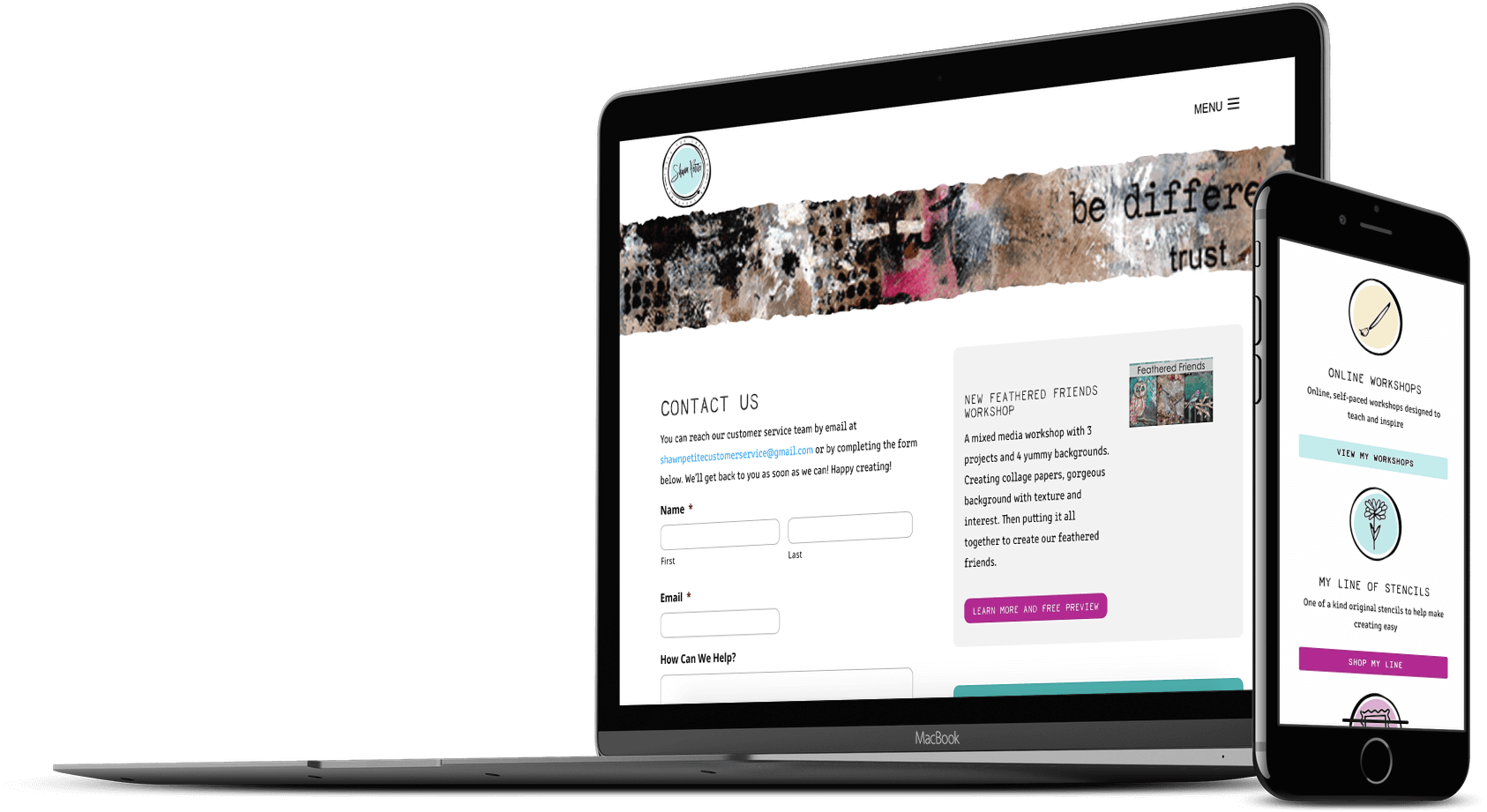
Solution
Striking a balance between clutter and clarity
•••
In design, I always seek to find the perfect visual balance. Believe it or not, the solution is never one size fits all. This is because the content I am working with is always so unique and different. With Shawn’s website, I had to find a balance between so many stunning works of art and the hard-working resources Shawn has dedicated so much time to creating. Each of these things are so important, I didn’t want to take attention away from either.
To find a solution that allowed both her work and resources to shine while also creating an intuitive experience for site visitors, I leaned heavily on whitespace, simple shapes, and a minimal color palette. I worked to create small vignettes of information and visuals that were easily consumed by users and that clearly defined the purpose that they served. The fact that the design of this website was simple, however, did not make it boring. The stunning new site offers just the right amount of mixed-media works and helpful details. Using small but intriguing details like a typeface reminiscent of a typewriter, edges of torn paper, and watercolor splotches keeps users moving throughout the site and enhances the information presented without distracting from the message.
Details
•••
Type
Colors
Graphics
Feeling inspired?
•••
So am I... Let's get started on a project that will transform your brand.