Willow+West Wholesale
Background
Finding the right ‘look’ for a brand
•••
When Jacklyn came to me looking for some sort of graphic to represent her brand, I knew we needed some sort of graphic logo that could work in multiple formats. Jacklyn had a vision for this graphic that embraced the family business aspect, and upon further discussion with her I had some ideas that would marry what both of us had in mind. Jacklyn wanted to ensure that she would have everything she needed to implement this in the future, which I took into consideration for the execution of the project.
Solution
A straight-forward graphic with the perfect vibe
•••
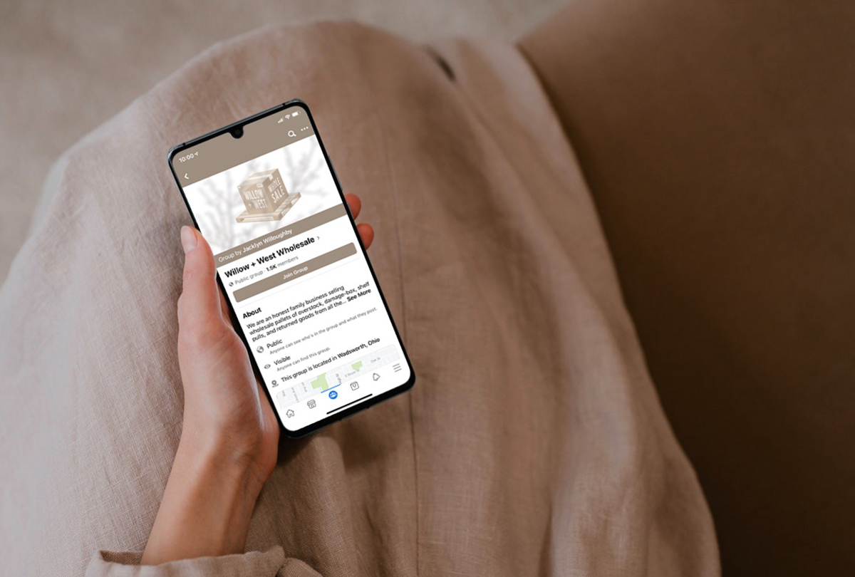
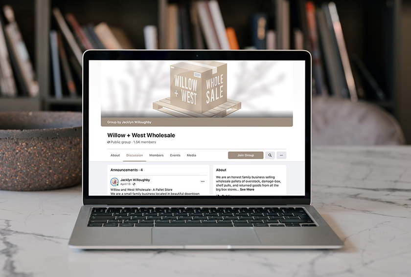
As soon as Jacklyn started describing her vision for the project and the vibe she was hoping to achieve, I had options moving through my mind. I created a straight-forward graphic consisting of the box and pallet that you see below. This would be instantly recognizable by clients and serve as a great graphic to be posted on social.
How would this work as a logo, though? The illustrated graphic was so strong that a thin line of text for the Willow + West name would not suffice. I decided to use a thick sans serif font and wrap the name around the box. This way, even when the graphic was scaled down, the name would still be clearly legible. The graphic turned out to be exactly what my client was looking for, and it was adorable.


Details
•••
Type
Colors
Graphics
Feeling inspired?
•••
So am I... Let's get started on a project that will transform your brand.